


Planning Outcomes from a Measured Baseline
We started with a full technical audit, which gave us a measured baseline and a clear project plan. Like most organizations with a long history online, the Chamber had a site that grew in layers over many years, on a brand system that predates the modern web. The rebuild needed to modernize the foundation and redesign the experience around today's visitors at the same time.
So before any layouts or templates, we began by thinking about people. We mapped how real visitors engage with a chamber of commerce, what they come looking for, and what the Chamber needs them to do next. Every decision that followed, from navigation to content hierarchy to the visual language, was tested against those distinct user journeys.
Membership & Participation
Every visitor arrives with a version of the same three questions: "Where do I start?" "What can I do here?" "How do I get involved?"
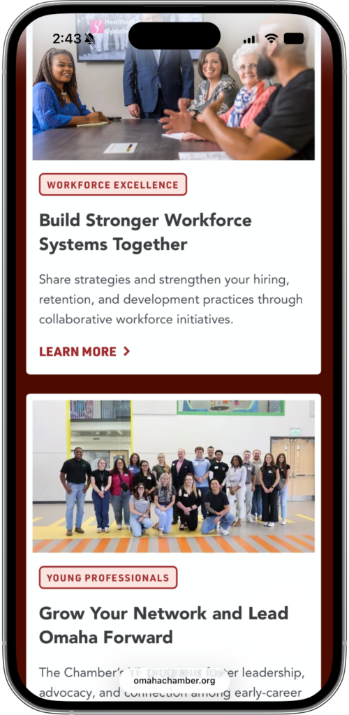
The new site is organized around answering them, with clear pathways to joining the Chamber, registering for events, exploring leadership programs and accessing business resources. Visitors get started instead of digging.
The Result?
Clear pathways that guide users to the information and resources that matter — joining the Chamber, registering for upcoming events, exploring leadership opportunities, accessing business resources and more. When engagement is intuitive, participation automatically grows. And with impressive performance and usability scores after launch, we built a website where visitors don’t have to dig for the information they need.
Traffic Increase
Drop in Bounce Rate
Organic Search Traffic
Platform Improvements
Behind the website is a platform rebuilt from the ground up. Pages now load in under a second, and a streamlined build leaves the Chamber team with a site they can update on their own, no developer required.
Main Content Load Time
Lighthouse Performance Score
Design System
The Chamber's brand was established and recognizable, and our job was to translate it for the screen. We consolidated the typography to two typefaces and tuned every color and text pairing to meet accessibility standards, which keeps the site readable on any device and lets the Chamber team build new pages without second-guessing whether a combination works.
Each major audience section has its own visual environment within the same brand system. Membership, economic development, life in Omaha and public policy each carry a distinct color treatment, so a prospective member and a corporate site selector land in spaces designed around what they came to do. As visitors move through the site, the color helps them stay oriented.
The angles of the Chamber’s triangle mark shape the page layouts themselves, which keeps the identity present in the structure of every page. The site runs on candid photos of real Omaha people and places., and the new image handling delivers roughly three times as many photos per page at 83% less total weight, so pages show more of the city and still load quickly.
Regional Impact
Community Engagement
Fresh storytelling and authentic Omaha imagery bring the city’s energy online. Dynamic event feeds and video features help residents and newcomers connect with the people shaping Omaha’s future.
Business Community & Networking
Integrated event calendars and streamlined membership tools connect professionals to leadership programs, roundtables and networking opportunities.
Resource Accessibility
From workforce initiatives to small-business programs, all of the Chamber’s resources are accessible within moments, on any device.
The Greater Omaha Chamber website has become the digital model for how local commerce organizations can translate civic ambition into tangible regional impact.

Driving Outcomes for Business Attraction
Shortly after launch, we separated the Chamber's economic development resources into a dedicated site: Select Greater Omaha.
It's a purpose-built front door for the investors and site selectors deciding where to expand companies and relocate talent, with the case for Omaha and the next step placed front and center.
We extended the Chamber's design system with a distinct color story, so the site reads as its own destination while staying part of the same brand. The result is a working pipeline: a site selector's first look at Omaha leads to investment resources, and investment leads to a clear path into Chamber membership once a business is ready to plug in and grow.
Telling Stories that Matter
The Omaha metro has momentum, and the Chamber's websites now put the proof in front of the people deciding where to invest, build and live. The sites celebrate the leaders driving change, spotlight the businesses shaping the Nebraska economy and surface the opportunities waiting for someone to take them.